Post by wordy on Mar 4, 2010 7:19:19 GMT 10

Icon Tutorial
by ubiquitous
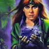
This issue, we are doing an icon tutorial. It should work for most versions of Photoshop, but you'll need to make some adjustments for Photoshop Elements. Some of the images in this tutorial are thumbnails, please click on them for a closer look. We are going to make this icon:

Step One: Crop and Resize
First, we will start with this image. It is a cover for Lioness Rampant from the Goldenlake Resources Rare Cover Gallery. Select the rectangular marquee tool (dotted square on the toolbar) and click and drag on the image to select the part of the image you want as the icon. Note that holding the 'shift' key when clicking and dragging will make sure that the shape you make is a square.Once you have selected the area, go to Image -> Crop. This should cut the image to the size and shape you had selected.
Then we'll shrink the image to icon size. Go to Image -> Image Size and under 'Pixel Dimensions' type in 100 next to 'width' and 'height'. Make sure the scale is in pixels, not percent.

Step Two: Curves
We're now going to add a curves layer, to brighten up the icon a bit, and play with the colour. To do this, go to Layer -> New Adjustment Layer -> Curves. Here, I've set two dot points - one at (output, input) (138, 126) and the other at (51, 76) on the RGB Channel.
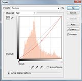
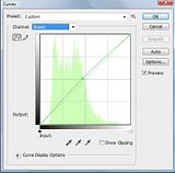
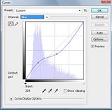
Alanna's face is quite red, so we're going to take some steps to counter that using curves. Select the Red Channel in the Curves dialog box, and set a point at (109, 138), to reduce the amount of red in the image. Then select the Green Channel in the Curves dialog box and set a point at (132, 119). And lastly, select the Blue Channel and create two points at (112, 137) and (74, 52). The changes to the blue channel won't affect the red as much as changing the red or green channels did, but it will intensify the blue in the background as well.


Step Three: Selective Colour
The image and colour is looking a lot better and deeper, but we've lost the purple of the stone and its glow. In order to fix this, we're going to create a selective colour layer to make it more purple-y.
To do this, go to Layer -> New Adjustment Layer -> Selective Color. Because we're changing the blues, select the colour 'cyan' from the drop down menu. Then select "-100%" cyan, "+100%" magenta, "-100%" yellow and "+20%" black.

Step Four: Hue
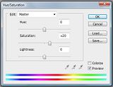
We're going to add a little more colour for extra pop with a Hue/Saturation layer. To do this, go to Layer -> New Adjustment Layer -> Hue/Saturation. I've set the saturation to 20 here.

Step Four: Levels
We're going to deepen the colours for more brightness with a levels layer. To do this, go to Layer -> New Adjustment Layer -> Levels. Then set the markers to (29, 1.13, 241).


Step Five: Shadow
We're going to create a shadow for the text to sit on top of, so that it's more visible. You can do this after you create the text, or use the blending options as well, but I find this gives a more subtle look.
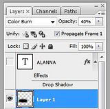
Create a new layer by going to Layer -> New -> Layer. Then grab a brush and circle over the area the text will be. I've used a soft 27px brush in black, but a similar sized brush can be used or different colours. Then change the layer blending to 'colour burn' with an opacity of 40%.


Step Six: Text
Add text. I've added the word 'Alanna' in Times New Roman (colour = white)


 Thanks a lot for writing it!